pixmoat / field notes / Problem-aware
Multi-viewport Playwright testing without a matrix explosion
Responsive visual testing gets expensive the moment “check mobile and desktop” becomes a real coverage requirement. A test suite with 20 important screens, three viewport sizes, two browser engines, and two device-pixel-ratio (DPR) targets can produce 240 screenshot combinations before you add themes, locales, or authenticated states.
The answer is not to test one viewport and hope the CSS behaves everywhere. It is to decide which dimensions are coverage and which are duplication. This guide shows how to choose a small, defensible viewport set, keep browser and DPR coverage separate, and add multi-viewport capture to Playwright without making every test harder to read.
Why the viewport matrix grows so quickly
A screenshot’s identity is more than a route. It is the rendered state: the screen or component, viewport, browser, DPR, branch, and usually the test data behind it. Change any of those inputs and you may have a different visual contract.
That is useful for catching real problems. A navigation bar can wrap at 375px but look correct at 1280px. A font can render differently in another browser. A layout that passes at DPR 1 can expose an image-sizing or canvas issue at DPR 2. The trouble starts when every dimension is multiplied by default, even when it is not relevant to the risk being tested.
There are three separate decisions hiding inside “more coverage”:
- Viewport coverage: does the layout adapt across the widths and heights your users actually encounter?
- Browser coverage: does the rendering or interaction differ between Chromium, Firefox, and WebKit?
- DPR coverage: does the application behave correctly when CSS pixels map to a denser device surface?
Treating all three as one giant matrix makes review noisy and makes failures hard to assign. A designer usually needs to see the responsive change in context; the test author needs to know which environment produced it. They do not need 240 unrelated cards in every review.
Choose coverage by risk, not by habit
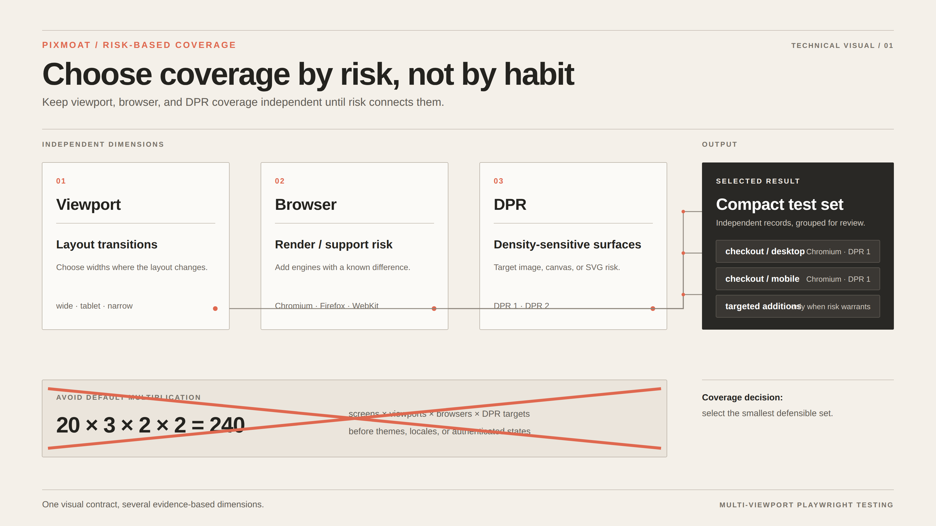
Start with the smallest set that represents meaningful layout transitions. For many product interfaces, that means one wide desktop viewport, one tablet-like portrait viewport, and one narrow mobile viewport. The exact values should come from your product’s breakpoints and supported devices, not from a universal checklist.
Then classify screens before adding them to the matrix:
- Critical flows: checkout, sign-in, navigation, billing, and other screens where a responsive defect blocks a task. Cover all chosen viewports.
- Layout-sensitive surfaces: dashboards, tables, dense forms, and component-library pages. Cover the viewport where the layout changes, plus a representative wide and narrow size.
- Low-risk pages: legal pages, static content, or screens whose layout is shared with a covered template. Cover one or two representative sizes until a change makes broader coverage worthwhile.
Do the same for browser and DPR. Add a second browser when you have a known rendering or browser-API risk, a support requirement, or a history of browser-specific regressions. Add a second DPR when the product uses images, canvas, SVG, or pixel-sensitive positioning that makes density relevant. If the risk is only a mobile breakpoint, adding Firefox and DPR 3 to every desktop screenshot is unlikely to improve the signal.
Keep the identity visible in the result. checkout / mobile / Chromium / DPR 1 should never be confused with checkout / desktop / Chromium / DPR 1, and neither should silently replace the other.
A practical workflow for scaling responsive checks
1. Stabilize one route first
Before adding dimensions, make one screenshot trustworthy. Use fixed or seeded data, wait for a user-visible ready state, make fonts and images deterministic, and disable motion that is not part of the test. Mask only values that are intentionally outside the assertion, such as a timestamp; do not mask the whole region whose responsive behavior you need to verify.
2. Add viewport coverage without changing the assertion
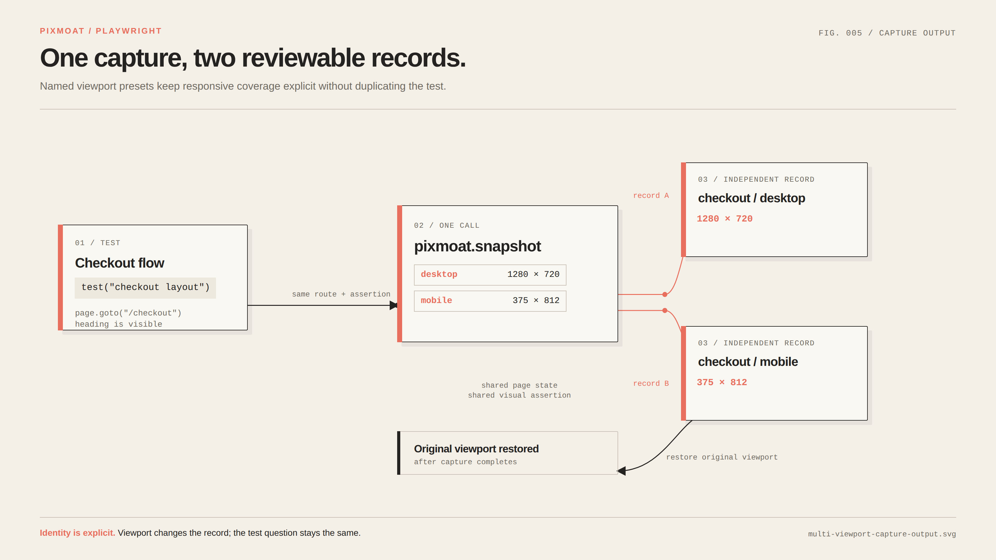
The page state and the visual question should stay the same while the viewport changes. “Does the checkout layout fit?” is one test question captured at several sizes, not three unrelated tests with three copies of the setup. This keeps the test name and snapshot key stable while the viewport remains part of the snapshot identity.
3. Expand dimensions in stages
A useful rollout is desktop plus mobile first, then tablet if it represents a real transition, then a second browser or DPR only for selected high-risk screens. Review the resulting failures before expanding again. If two viewports always produce the same layout and no distinct risk, keep the cheaper representative unless your support requirements say otherwise.
4. Review by screen, then viewport
When a failure appears, ask whether the same change is present across sizes. A button wrapping only at mobile width suggests a responsive constraint. A difference at every width suggests a shared component or data issue. That distinction is easier to see when results are grouped by snapshot name and the viewport is a visible tab, rather than when each combination is a separate anonymous CI artifact.
Reproducible example: two viewports from one capture
Here is a compact setup using named presets. Put this .pixmoat.yaml at the repository root:
version: 1
viewports:
  desktop: 1280x720
  tablet: 768x1024
  mobile: 375x812
Then capture the same route at the desktop and mobile presets:
import { test } from "@s4labs/pixmoat-playwright";
import { expect } from "@playwright/test";

test("checkout layout", async ({ page, pixmoat }) => {
  await page.goto("/checkout");
  await expect(page.getByRole("heading", { name: "Checkout" })).toBeVisible();

  const results = await pixmoat.snapshot(page, "checkout", {
    viewports: ["desktop", "mobile"],
  });

  expect(results).toHaveLength(2);
});
The documented fixture captures each viewport as an independent snapshot and restores the original viewport after the call. The result is two reviewable records for checkout, one at 1280x720 and one at 375x812, rather than a test duplicated just to resize the page. If your project needs the same default everywhere, PIXMOAT_VIEWPORTS=desktop,mobile applies the defaults when a snapshot does not specify its own viewport.
This example assumes the Playwright project already has a baseURL and that the checkout heading is a stable readiness signal. Replace those details with the route and ready state in your application. The important properties are reproducible state, named dimensions, and one explicit coverage decision.
Where Pixmoat fits
Pixmoat is Playwright-first and Playwright-only in v1. Its @s4labs/pixmoat-playwright client supports a fixture API for explicit captures and a reporter for existing Playwright toHaveScreenshot() tests. The fixture can capture multiple viewports in one call; environment defaults and .pixmoat.yaml presets let a team review viewport coverage as configuration rather than scattering dimensions through test files.
Each uploaded snapshot carries its viewport, browser, and DPR dimensions. Pixmoat uses deterministic pixel comparison, so a changed pixel is evidence to review—not an AI-generated explanation of whether the change is “good.” In the review UI, multiple viewports for one snapshot name are grouped into viewport tabs, and each viewport has its own approval decision. That gives a designer the context to compare responsive behavior while leaving the test author with an explicit result for each size.
There are limits. Pixmoat does not choose your product’s breakpoints or tell you which screens deserve coverage. Capturing three viewports still creates three snapshot records, and an unstable page remains unstable; flakiness detection can identify repeated capture mismatches, but it cannot make live data or late-loading assets deterministic. If you need a full browser-by-viewport-by-DPR grid, budget for the resulting review and storage volume deliberately.
For setup details, see the Playwright integration guide, then use the project configuration file guide to keep named viewport presets reviewable in Git. Once the captures arrive, use the visual review guide to check each viewport consistently.
A sensible default to start with
Choose one wide, one narrow, and—only if it represents a real layout transition—one tablet viewport. Apply all three to critical responsive flows, and use a smaller set for low-risk screens. Add browser engines and DPR targets where they correspond to a user, support, or rendering risk. Review the first few builds, remove redundant combinations, and expand from evidence.
When you are ready to put that decision into the suite, configure viewport coverage in .pixmoat.yaml or with PIXMOAT_VIEWPORTS, add one multi-viewport snapshot to a critical route, and verify the desktop and mobile results before broadening the matrix.